First contact is often not your website
A search result, a map listing, an AI-generated summary or a social profile is frequently the first encounter. Identities designed only for a homepage arrive as fragments everywhere else.
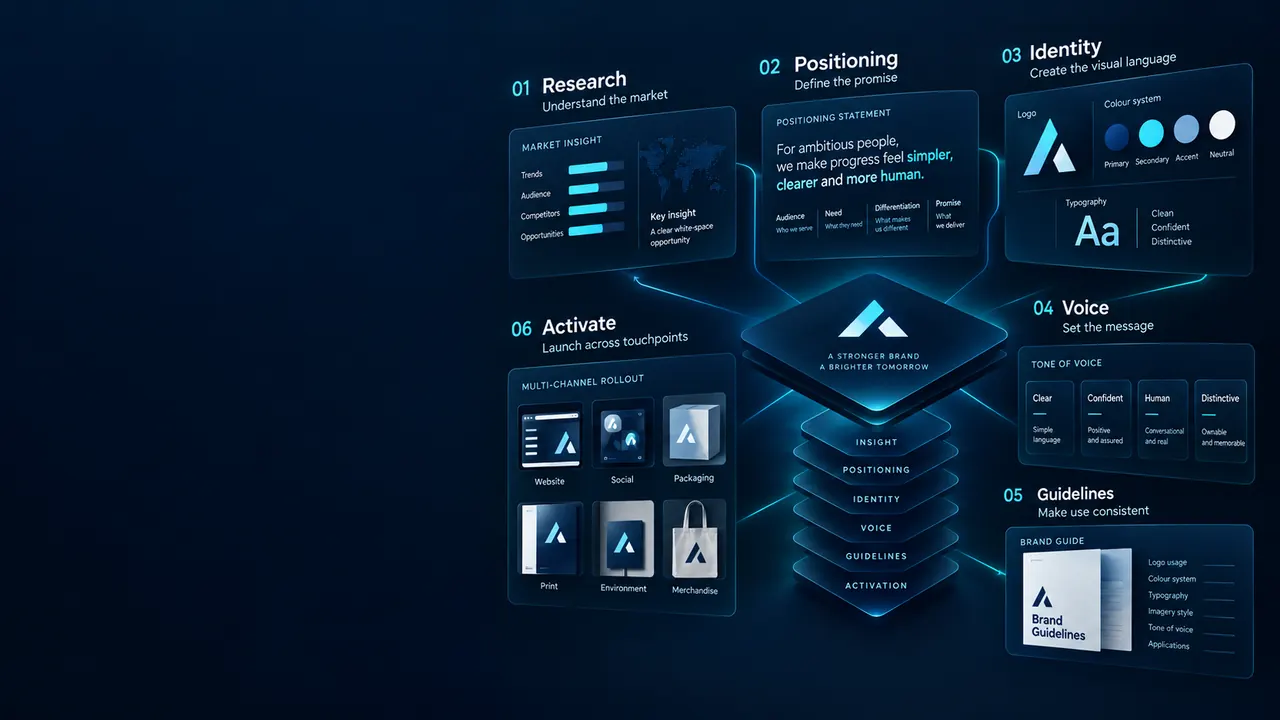
A brand is what people expect from you before they deal with you. Our branding and brand identity design services build the identity, the language and the rules that make a business recognisable and consistent — across every place a customer meets it.
Our branding services build a complete system, not just a logo file — strategy, brand identity design, logo design services, typography, colour and usage guidelines. As a rebranding agency we also rework existing brands so they hold together across web, ads and print.
Get a free audit →A complete identity system your team can use every day, not just a logo file.
Who you are for, what you stand for and why it matters.
Name development and checks when you need a new name or product line.
Primary mark, variations and lockups tested at every size.
An accessible palette and type system with clear pairing rules.
How the brand sounds, with examples your writers can follow.
Brand guidelines plus editable templates for everyday use.
The test of an identity is not the presentation. It is whether the business still looks coherent two years later, when a dozen people have made things without us.
Marks are tested small, in monochrome and reversed before they are approved. An identity that only works in full colour at large sizes fails at exactly the moments it is seen most — favicons, app icons and stamped material.
Palettes are checked against WCAG contrast ratios in the combinations you will actually use. A brand colour that cannot legally carry body text creates a permanent conflict between design and accessibility.
Font licensing is confirmed for web, desktop and app use before specification. Unlicensed commercial font use is common, genuinely enforceable, and entirely avoidable.
“Friendly but professional” means nothing to the person writing your next email. Guidelines include real before-and-after rewrites so the standard is demonstrated rather than described.
Editable templates for the things you produce weekly. A brand that needs a designer for every social post gets abandoned quietly within a few months.
Rights assigned in writing, with vector masters supplied. Some studios retain ownership or withhold source files — we consider that indefensible for work you commissioned.
Where brands are encountered has changed faster than how most of them are designed.
A search result, a map listing, an AI-generated summary or a social profile is frequently the first encounter. Identities designed only for a homepage arrive as fragments everywhere else.
Brands appear in video, stories and interfaces. How a mark animates and how transitions feel are becoming identity decisions rather than afterthoughts.
Contrast requirements are pushing brands away from low-contrast pastel systems that photograph well but fail in use. Designing to the standard from the start avoids a later forced revision.
A decade of simplification left many categories looking identical. Assets that are genuinely ownable — a shape, a colour, a voice — now do more work than another clean wordmark.
A full identity typically takes six to ten weeks from discovery to rollout.
Stakeholder interviews, audience and competitor audit.
Positioning and personality agreed before any design.
Directions tested on real applications, then refined.
Guidelines, templates and final files handed over.
Straight answers on cost, scope and whether you need a rebrand at all.
A refresh is right when the positioning still holds and the execution has simply aged — you keep recognition and modernise the delivery. A full rebrand is warranted when what you sell, who you sell to, or what you stand for has genuinely changed. Rebranding a business people already recognise, purely for visual reasons, throws away equity you paid to build.
It scales with the number of decisions and applications, not with the number of logo options. A sole trader needing a mark and basic templates sits far below a multi-location business needing signage, vehicle livery, packaging and a full guideline system. We scope from the applications you actually need.
Two or three genuinely distinct directions, each properly worked through and shown in real applications. Presenting a dozen options usually means most were not thought through, and it turns the review into a preference vote rather than a decision against the brief.
You do, assigned in writing, including vector masters and the right to modify. Some studios retain ownership or supply only exported files so you must return for every change. We consider that unacceptable for work you commissioned and paid for.
Yes, and often that is the sensible route. Many businesses have a serviceable mark and no system around it — no palette rules, no type scale, no voice, no templates. Building the system around an existing mark preserves recognition and usually delivers more practical benefit than a redraw.
We run availability screening during naming and design so you do not fall in love with something unprotectable, and we will flag obvious conflicts. Formal clearance and registration need a trademark attorney — we are not lawyers and will not pretend the screening is a legal opinion.
Guidelines alone rarely work; templates do. We supply editable files for the material you produce weekly and brief the team on where things live. The brands that stay consistent are the ones where doing it correctly is easier than improvising.
Tell us where the business is being misunderstood. We will review how you currently present across every touchpoint and show you what is inconsistent, unclear or working against you.
Further reading
Go deeper on the methods behind this service, with guides written by the specialists who run them, plain-English definitions and the services that usually work alongside it.
 Digital Marketing
How to write content that converts: copywriting formulas, benefit-led messaging, specificity, social proof, microcopy and calls to action that work.
Read the guide Web Design
The 5-second website test: how to check if visitors instantly understand what you do, how to run it, the questions to ask and fixes that improve conversions.
Read the guide Case Studies
A composite D2C fashion growth playbook: how founder-led content, offer testing, email retention, CRO and SEO sequence to build a profitable ecommerce brand.
Read the guide