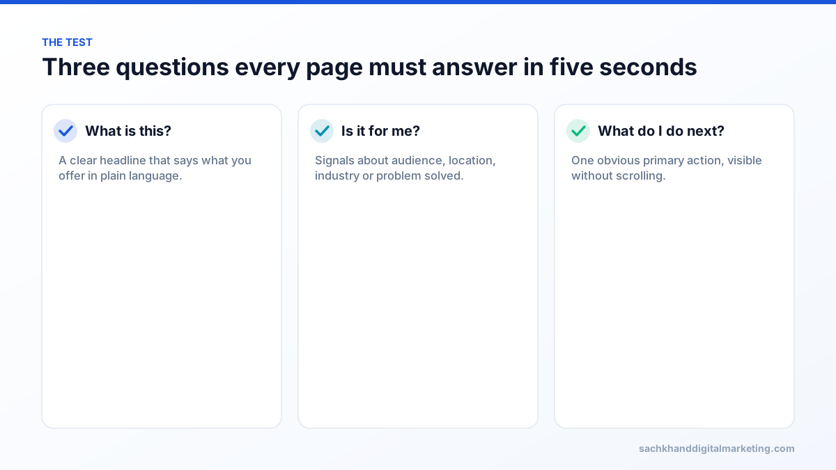
The 5-second test checks whether a first-time visitor can understand what you offer, who it is for and what to do next within five seconds of landing. Show the page briefly to people who do not know your business, then ask what they remember. If they cannot answer, tighten your headline, simplify the visual hierarchy, make one call to action obvious, add instant trust signals and make sure the page loads quickly on mobile.
On this page
- What is the 5-second test?
- Why first impressions decide conversions
- How to run a 5-second test
- What to fix when a page fails
- A quick above-the-fold checklist
- Beyond the test: measuring real behaviour
- Conclusion
- Examples: before and after
- Tools for running the test
- A page clarity plan you can follow this week
- How clarity affects SEO and paid traffic
- Frequently asked questions
Visitors decide very quickly whether a website is worth their attention. They scan the headline, glance at the imagery, look for signals that they are in the right place and either engage or hit the back button. The 5-second test is a simple way to find out whether your page passes that first impression. It costs almost nothing, takes an afternoon, and regularly uncovers problems that no amount of SEO or ad spend can fix. The 5 second test (also called the five second test for a website) measures your website first impression: whether a stranger understands what you do within five seconds. Website clarity is the first thing we check.
What is the 5-second test?
A 5-second test is a usability method where participants see a web page for five seconds, then answer questions about what they saw and understood. It was popularised by user experience researchers and is offered by user testing platforms, but you can run it manually. It measures clarity, not beauty: whether people grasp what the page is, who it is for and what to do next.
Why first impressions decide conversions
- Attention is scarce. People arriving from search or ads are comparing options and leave quickly if the page does not match their intent.
- Confusion is expensive. Every visitor who bounces because they did not understand your offer is paid media or SEO effort wasted.
- Engagement supports SEO indirectly. Pages that satisfy searchers earn more links, shares and repeat visits.
- Trust forms early. Visitors judge credibility from design quality, clarity and proof before reading detail.
How to run a 5-second test
Choose the right testers
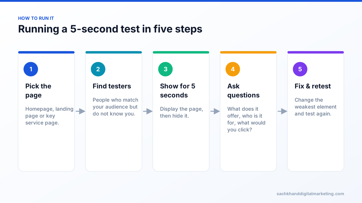
Testers should resemble your target customers but not know your business. Colleagues and friends already know what you do and will over-estimate clarity. Online testing platforms can recruit participants by demographics; for B2B, short calls with prospects or customers of adjacent services work well.
Ask the right questions
- What does this company or page offer?
- Who do you think it is for?
- What would you click first, and why?
- What words or images do you remember?
- How would you describe this company to a friend?
- Did anything feel confusing or untrustworthy?
Score the results
Group answers into “understood correctly”, “partly understood” and “misunderstood” for each question. If fewer than most testers can state what you offer and what to do next, the page needs work before you invest more in traffic.
What to fix when a page fails
1. The clarity proposition
Your headline should say what you do, for whom and ideally the outcome, in plain language. “Innovative solutions for tomorrow” fails the test; “Emergency plumbing in Houston, at your door in 60 minutes” passes. Put the most important words first and support them with a one-sentence subheading.
2. Visual hierarchy and white space
The eye should move from headline to supporting line to call to action. Reduce competing elements: sliders, multiple headlines, dense navigation and decorative graphics dilute attention. Use size, contrast and spacing to make the key message dominant.
3. One obvious call to action
Offer one primary action above the fold, such as “Get a free quote” or “Book a demo”, with a clearly secondary option if needed. Button text should describe the outcome, not “Submit” or “Learn more”.
4. Speed is part of the five seconds
If the page is still loading after several seconds, the test is failed before it starts. Optimise images, reduce scripts and meet Core Web Vitals thresholds, especially on mobile.
5. Instant trust signals
- Recognisable client logos, certifications or awards.
- Review ratings with a count, such as “4.9 from 380 Google reviews”.
- A short testimonial or result near the call to action.
- Real photos of your team, premises or work instead of stock images.
- Clear contact details and location for local businesses.
6. Match the visitor’s intent
A visitor who searched “commercial roof repair” and lands on a homepage about residential roofing will leave even if the design is excellent. Send traffic to the most relevant page and echo the search language in the headline.
7. Mobile is the real test
Most visitors see a small screen first. On mobile, check that the headline and call to action appear without scrolling, text is readable without zooming, buttons are easy to tap and pop-ups do not cover the content.
A quick above-the-fold checklist
| Element | Pass | Fail |
|---|---|---|
| Headline | States offer and audience plainly | Vague slogan or company name only |
| Subheading | Adds outcome or proof | Repeats the headline |
| Call to action | One clear, specific button | Several competing buttons or none |
| Imagery | Shows product, service or result | Generic stock photo |
| Trust | Reviews, logos or credentials visible | No proof until far down the page |
| Speed | Main content visible quickly on mobile | Blank or shifting page |
Beyond the test: measuring real behaviour
The 5-second test shows what people understand. Combine it with analytics and behaviour tools: engagement rate and scroll depth, heatmaps and session recordings, form analytics and conversion rate by landing page. Then run A/B tests on the elements your test identified. Our CRO guide explains how to prioritise and test changes.
Get a prioritised action plan from our specialists, free.
Conclusion
If a stranger cannot tell what you do within five seconds, the rest of your page, and the money spent bringing people to it, is working much harder than it needs to. Run the test on your most important pages, fix the headline, hierarchy, call to action and trust signals, and test again.
Examples: before and after
| Business | Fails the test | Passes the test |
|---|---|---|
| Accounting firm | “Your trusted partner for success” | “Bookkeeping and tax returns for UK contractors, fixed monthly fee” |
| Roofing company | Slider with five rotating messages | “Roof leak? Same-day repairs across Manchester” with one call button |
| SaaS product | “The platform for modern teams” | “Schedule shifts for restaurant staff in minutes, free for 14 days” |
| Dental clinic | Stock photo of a smiling model and no contact details | Real clinic photo, “Invisalign from £2,400”, review rating and “Book a free consultation” |
Tools for running the test
- User testing platforms that offer five-second or first-impression tests and recruit participants by demographic.
- Video calls where you share the screen for five seconds, then ask your questions.
- Printed or on-screen mock-ups for testing headlines before a page is built.
- Heatmap and recording tools to confirm whether real visitors behave the way testers predicted.
A page clarity plan you can follow this week
- Day 1: list your three highest-traffic landing pages and their conversion rates.
- Day 2: run the 5-second test with five people on each page.
- Day 3: rewrite headlines and subheadings using testers’ language about what they expected to find.
- Day 4: simplify above-the-fold layout to one message, one image and one call to action; add a trust signal.
- Day 5: retest with new participants and compare answers.
- Following weeks: A/B test the new version against the original on live traffic.
How clarity affects SEO and paid traffic
Clear pages benefit every channel. In search, pages that match intent and answer questions quickly are more likely to satisfy visitors and earn engagement and links. In paid campaigns, landing page experience influences Google Ads Quality Score, and higher conversion rates lower cost per lead on every platform. Fixing clarity is one of the few improvements that makes both organic and paid traffic more valuable at once.
Frequently asked questions
What is the 5-second website test?
It is a usability test where people see a web page for five seconds and then answer questions about what it offers, who it is for and what they would do next. It measures how clearly a page communicates at first glance.
Why do visitors leave a website so quickly?
Common reasons are an unclear headline, a page that does not match what they searched for, slow loading, cluttered design, no obvious next step and a lack of trust signals.
How many people do I need for a 5-second test?
Five to ten testers per page version usually reveal the biggest clarity problems. Use more testers when comparing versions for a decision.
How do I reduce my website’s bounce rate?
Match landing pages to visitor intent, write a clear headline, make one call to action obvious, add trust signals near the top, improve mobile speed and remove distracting elements.
What should be above the fold on a homepage?
A clear headline stating what you offer and for whom, a supporting line with the outcome or proof, one primary call to action, relevant imagery and at least one trust signal.
Need a site that passes the test and converts?
Talk to our team about your goals. We will show you where the biggest wins are, starting with a free, no-obligation audit.